Idea book
Tips for creating a mid-century modern space
Old is gold.
Design is much like a ferris wheel ─ the trends are cyclical and flow in circles. A trend may soar high before it disappears to the bottom. When it resurfaces, it's even better and more advanced. Likewise, human nature and its ideas evolve along the same pattern. That's exactly what happened to mid-century modern design recently.
High quality building materials readily sourced in the 50’s and 60’s (teak, glass, metals, raw natural materials) are now deemed artistic, aesthetic, functional and natural. With a high sense of class and some modern twists, mid-century modern design is ubiquitous again.
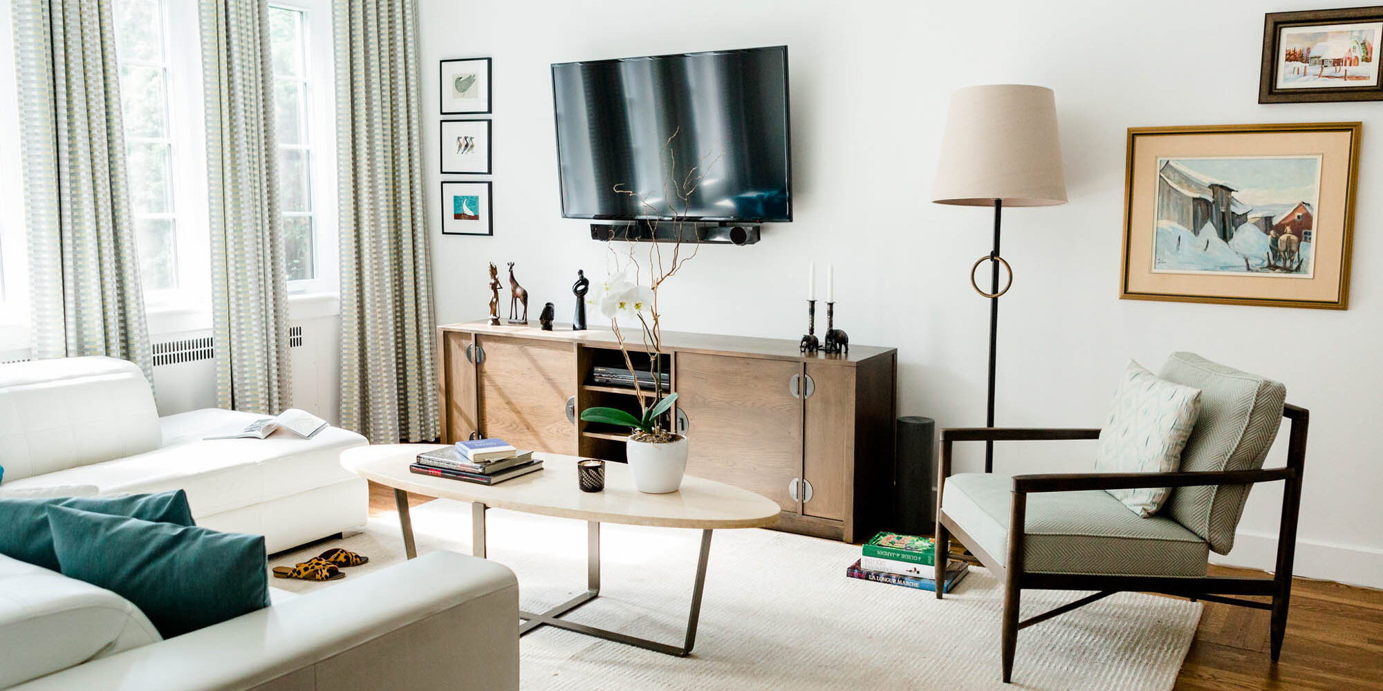
Characterized by clean lines, natural materials, gentle organic curves, simple forms, neutral colour palettes, minimal ornamentation, high functionality, and a love for different materials, mid-century modern simplicity is defined by its complexity. Interior designers have grown to embrace the antiquity of mid-century modern design.
Today, mid-century design can either be fully implemented as a design on its own or infused or blended into others for a timeless feeling.
Here are a few essential tips for adding some mid-century modern style to your space.
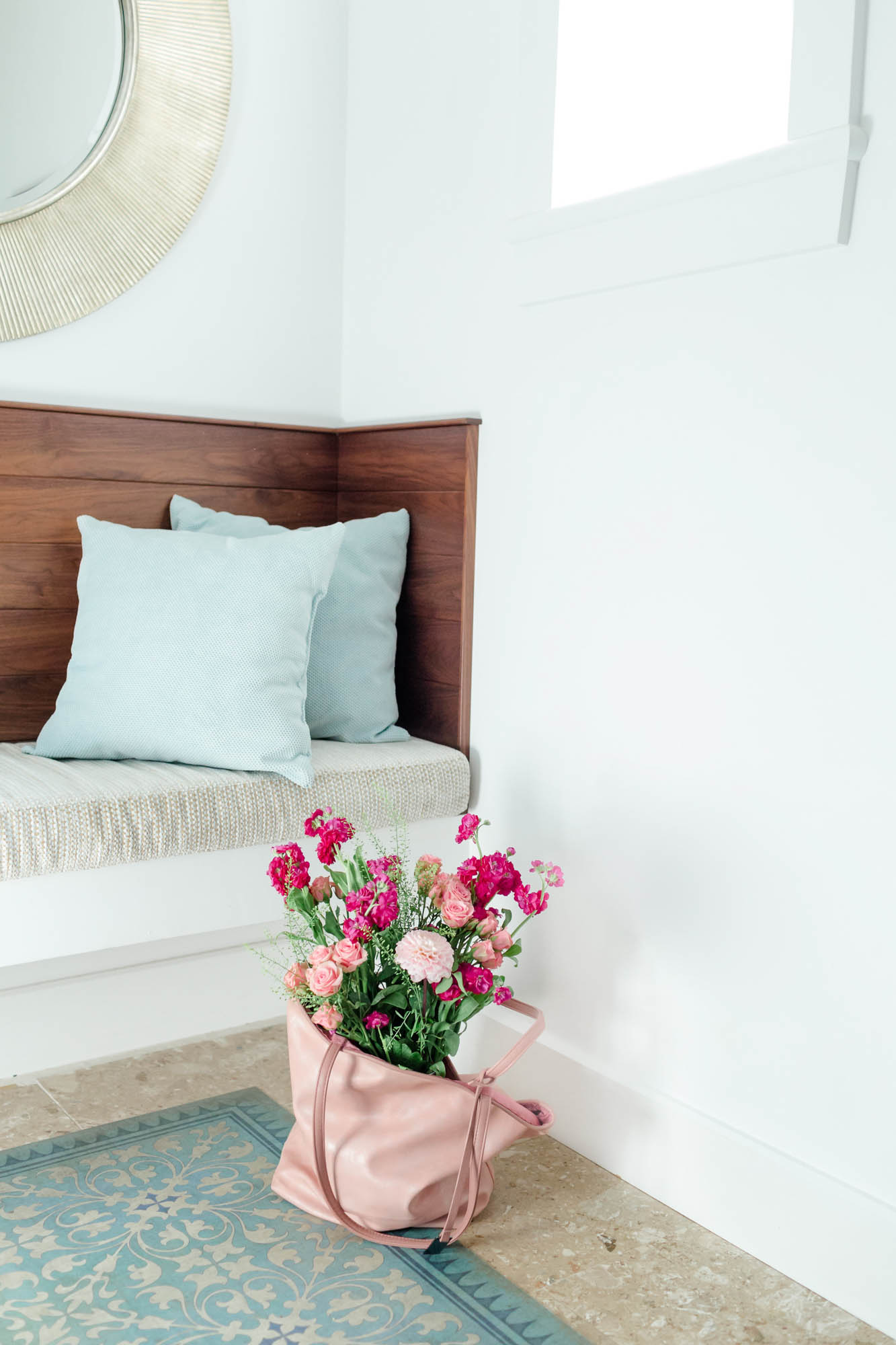
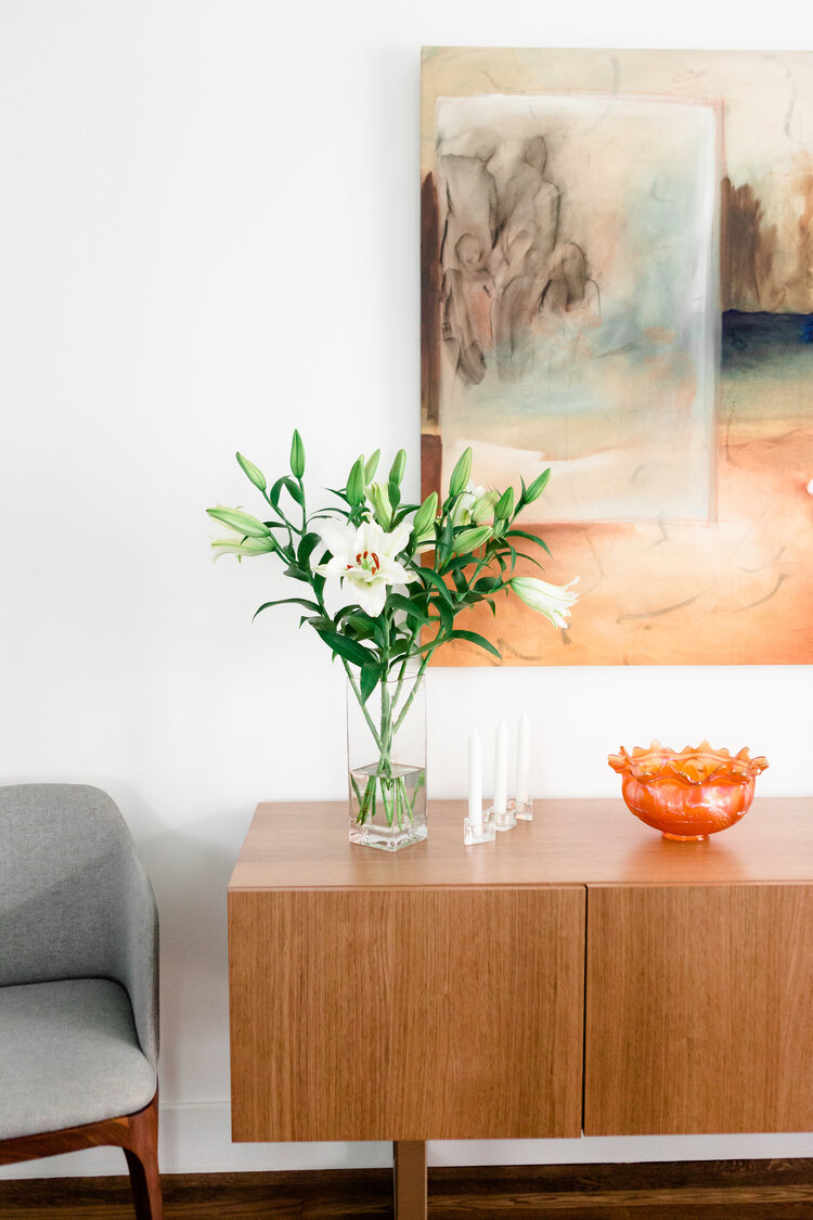
Use earthy, natural, and warm colours
Select any vibrant, versatile, vivid, and playful colour combination you desire.
Lean towards an earthy palette of natural, warm tones with a little pop of a bright colour.
Dominant colours include, natural wood brown, olive green, orange, velvet, a few tones like pink and beige, or darker shades such as greys, sienna or amber.
Neutral colour palettes produce the best results.
Use natural materials.
Wood, stone, metal, bricks, straw, and other natural materials are an easy indication of mid-century modern design.
Remember, the core aim of this movement was functionality via the most available raw materials, which
at the time were more log cabin oriented. You can use these materials for anything from furniture, decor pieces, or even structural features.
A few creative ways of using mid-century design materials in your space include:
- Natural or stained wood for seats, door and window frames, tables, shelves, hanging racks etc.
- Rustic materials for chandeliers and lamps, table flower vases, organic curve sculptures, metallic pots, pans, etc.
- Bricks for your fireplace or as wall cladding for warmth
- Ceramic or porcelain bowls in the kitchen, or planter vases around your space could also enhance that vibe
In case you cannot afford the natural state of the functional items stated earlier, imitations could also work to your advantage:
- Wallpapers
- Paint
- PVC cladding
- Use warm, familiar materials and mold them into mid-century modern features
Furniture pieces can double as art ─ sculptured, yet functional. Their organic forms stand out artistically.
Some iconic, mid-century furniture pieces that endured the test of time include:
- The Eames Lounge Chair
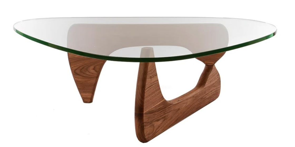
- The Noguchi Table
- The Florence Knoll Sofa
- The Tulip Oval Table
Select your furniture in dark shades and wooden finishes. This design movement is characterized by a love of different materials, so you don’t have to worry too much about finding matching pieces. You can freely explore how different colours, textures, and materials create magic.
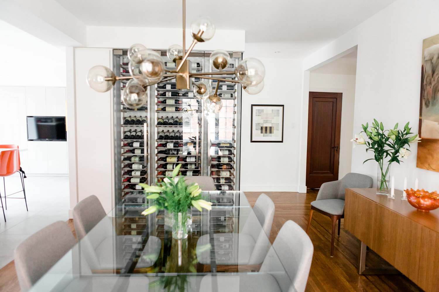
Creative lighting
Lighting in this movement is not as simple as function and accent. Its presentation to the room is crisp and deliberate. Instead of using accessories, lights are hung with an artistic purpose. Chandeliers, wall, table, and floor lamps are all classically chosen or customized to be the centre of attraction.
When you shop for your lighting fixtures, go for warm-coloured lamps with a natural metallic or reflective attribute. You could also try natural, bamboo lamp holders or sisal-tied chandeliers for an earthy feel.
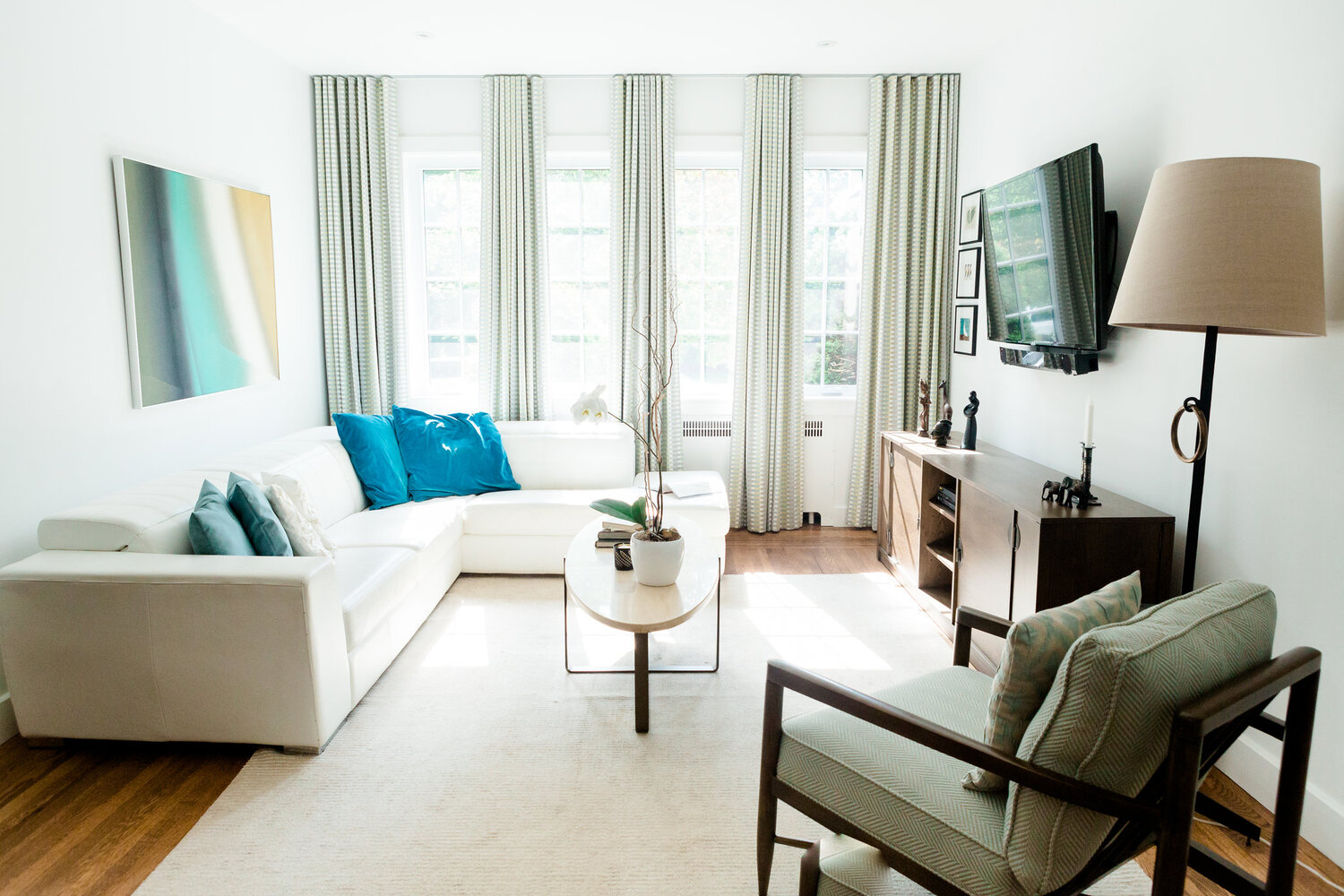
Define clean, sharp lines around the space
Incorporate vivid, clean lines into the finishes of the architectural structure. You could use dark or wooden frames for windows and doors that contrast the surface area around them. Use structural beams in the ceiling arranged in clear geometric patterns to create simple forms, while amplifying the visibility and use of lines.
Tables, cabinets, and furniture should also display individually artistic, yet virtuous lines. Despite diversity in forms, shapes and curves, the fluidity of the lines is maintained.
Given the high functional quality of the mid-century, accessories were not a priority. However, when used, they had to be simple vintage antique pieces of high value and significance.
To effectively use accessories to create the mid-century modern vibe, use antique-polished vases with smooth curves on tables, bookshelves, cabinets, or dressers. They could be porcelain or metal. Wooden, stone or metal sculptures are another beautiful addition to any space.
A mix-and-match of textures also enriches the aura. Add different cushions and textiles to your collection from different prints and sizes to enhance the mod atmosphere.
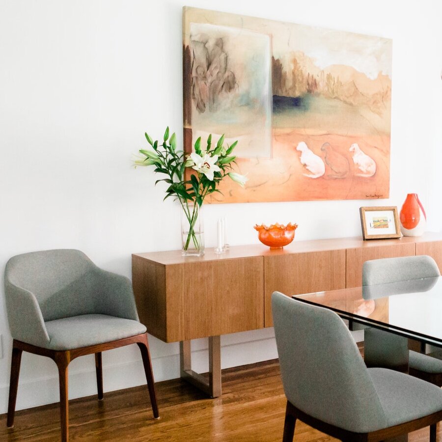
Include a statement art piece
Big and bold is the way to go. No mid-century modern design is truly complete without a statement piece of artwork on the wall. It should draw attention to itself without competition.
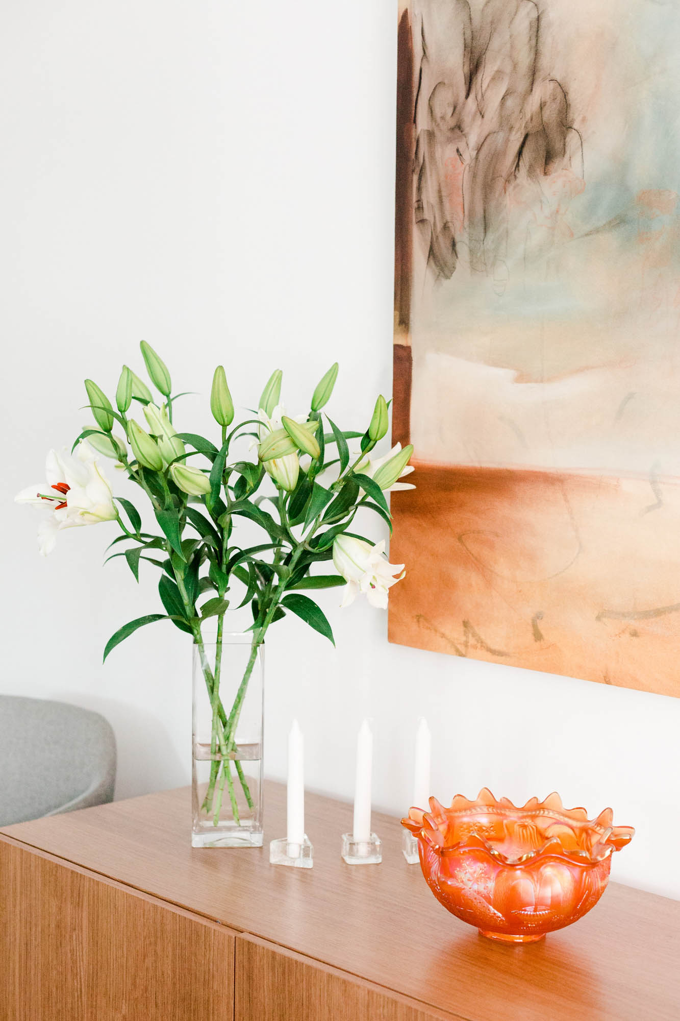
Don't forget to let nature in
Mid-century modern design was characterized by large, open windows that let the outside in as an extension of environment. Using foliage inside your space enhances this interaction, while adding character and movement. Planters liven the space and have health benefits beyond their attractive aesthetic nature.
